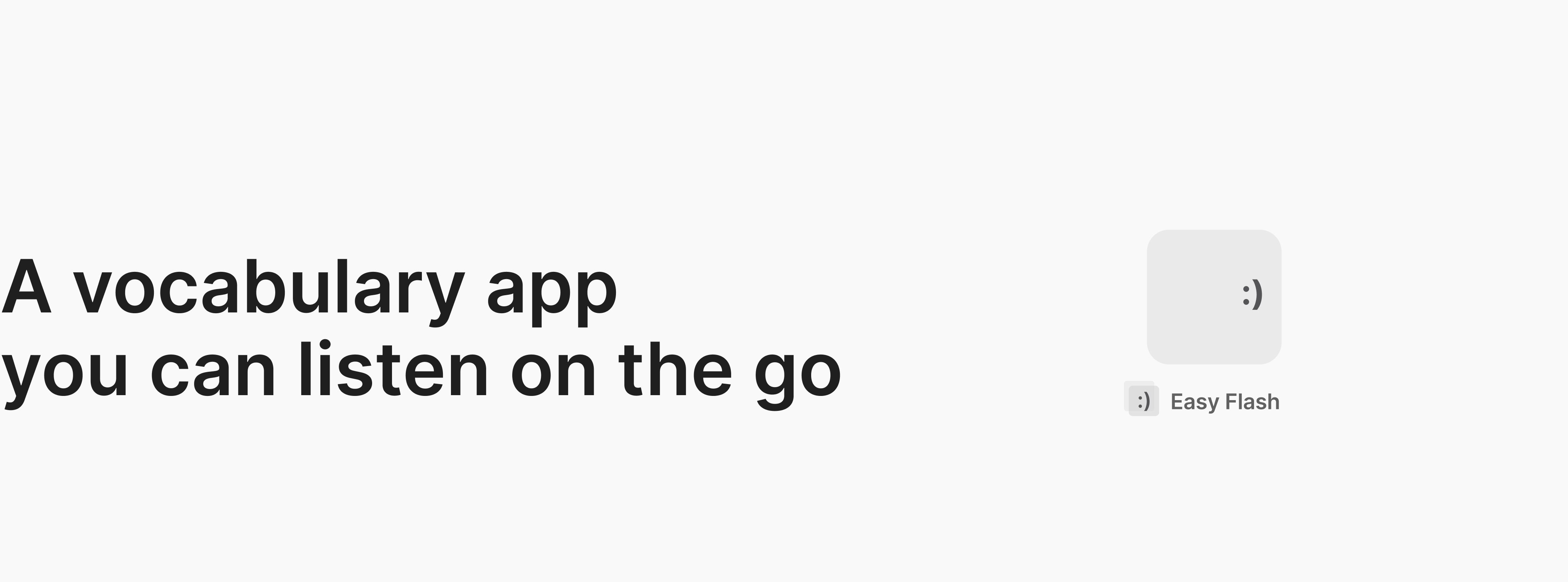
Design an app that makes learning vocabulary easier
UX Strategy, User Research, Information Architecture, Wireframing & Prototyping & Testing
1 month, Oct – Nov 2020
Figma, Miro, Optimalworkshop
Nowadays, the way of learning is changing, more people opt for online courses to continue educating themselves. Not only the students need to learn new vocabulary, people of all ages and backgrounds also take courses. However, with so many new concepts and terms to learn and internalize, it can feel a bit overwhelming and challenging. How might we design a mobile app that empowers people to learn new vocabulary effectively?
Problem & Opportunities
- Brainstorming
- Competitor Analysis
- User Interviews
Concept Generation
- Personas
- User story and User Flows
- Identify features
Design and iterate
- Wireframing and Prototyping
- Usability Testing
Identify the main competitors in the
vocabulary learning market
Identify successful features that competitors used in empower vocabulary learning
Explore unsuccessful features, understand what causes users’ frustration
Gain a broad understanding of users vocabulary learning behavior
01 Brainstorming
Brainstorming ideas before research
02 Competitor Analysis
App review videos on YouTube
User review on IOS and Google play
Self walkthrough of competitor web/app
03 User Interviews
User interviews with friends, and ux students
The problem is how might we design a mobile app that empowers people to learn new vocabulary. I start by thinking, why people need to be empowered?
My assumption? We all find it hard to keep consistent in what we do, and that is exactly the most important part of learning new vocabulary, of learning anything.
So the underlying problem we are solving is - how do we make it easier for people to form a good habit of learning vocabulary? With this new narrative in mind, I started my competitor research, to see how other apps help users form habits of learning vocabulary as well as the general user experience of the apps.
App review videos on YouTube
I know vocabulary app is a digital learning tool that most welcomed in the students group, therefore, I start my research with YouTube, as it's the most effective way to begin with.

| Insights
After watched the video, I learned that
3 criteria that matter most to users (students group):
Effectiveness + Workflow (usability) + Accessibility
Priority: Out of these three criteria, the effectiveness for study is the most important one.
Key competitors: Anki and Quizlet
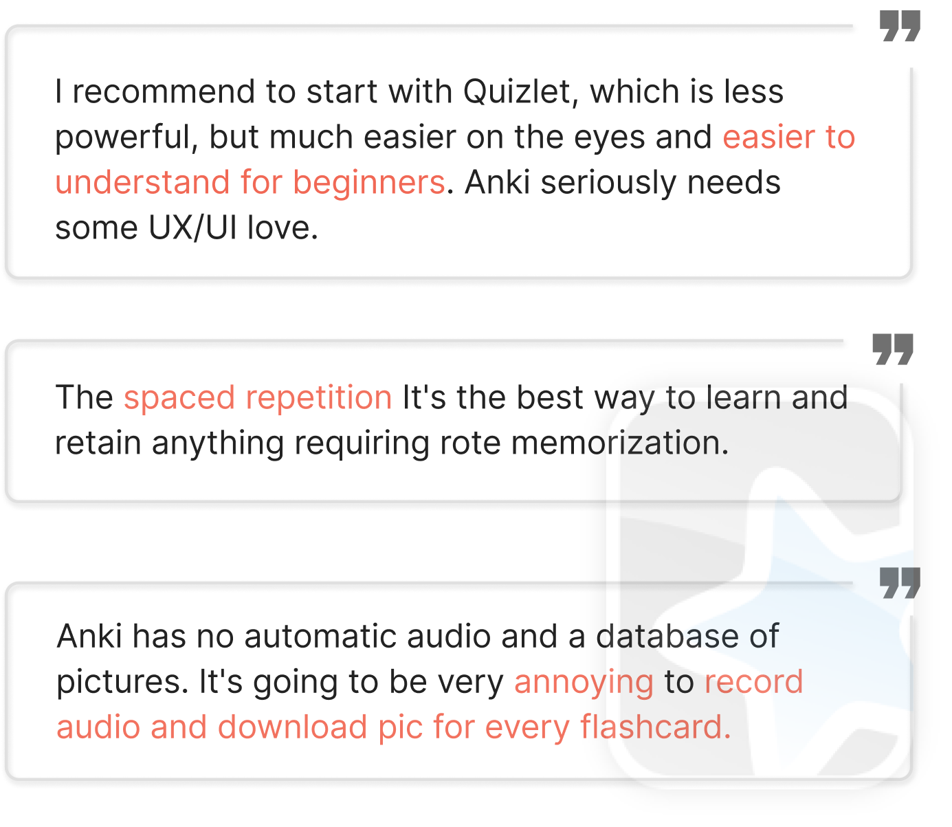
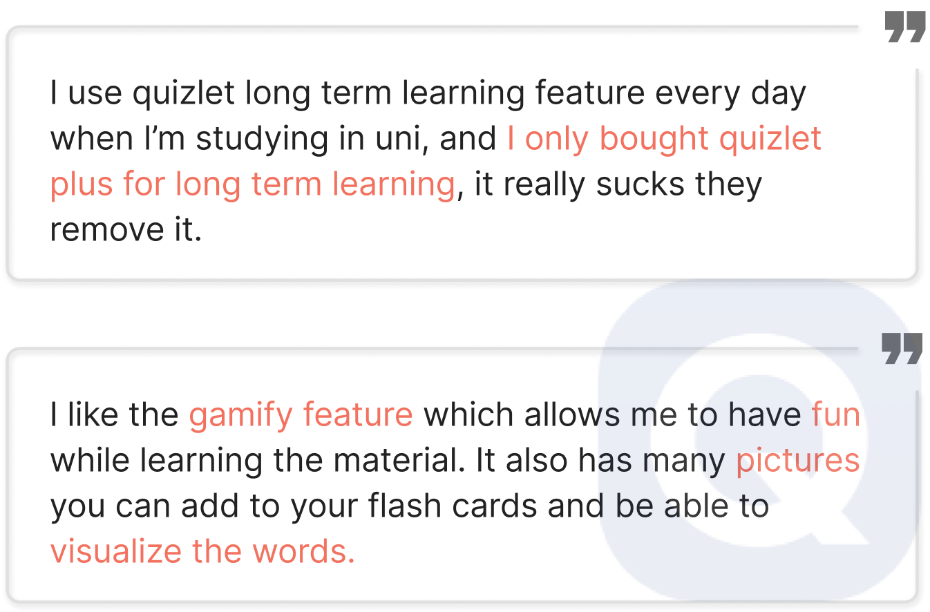
User reviews on IOS and Google play
Anki
| Insights
Anki is better at effective, bad in visual design
Quizlet is better at workflow and accessibility
Quizlet
Self walkthrough of competitor web/app
| Insights
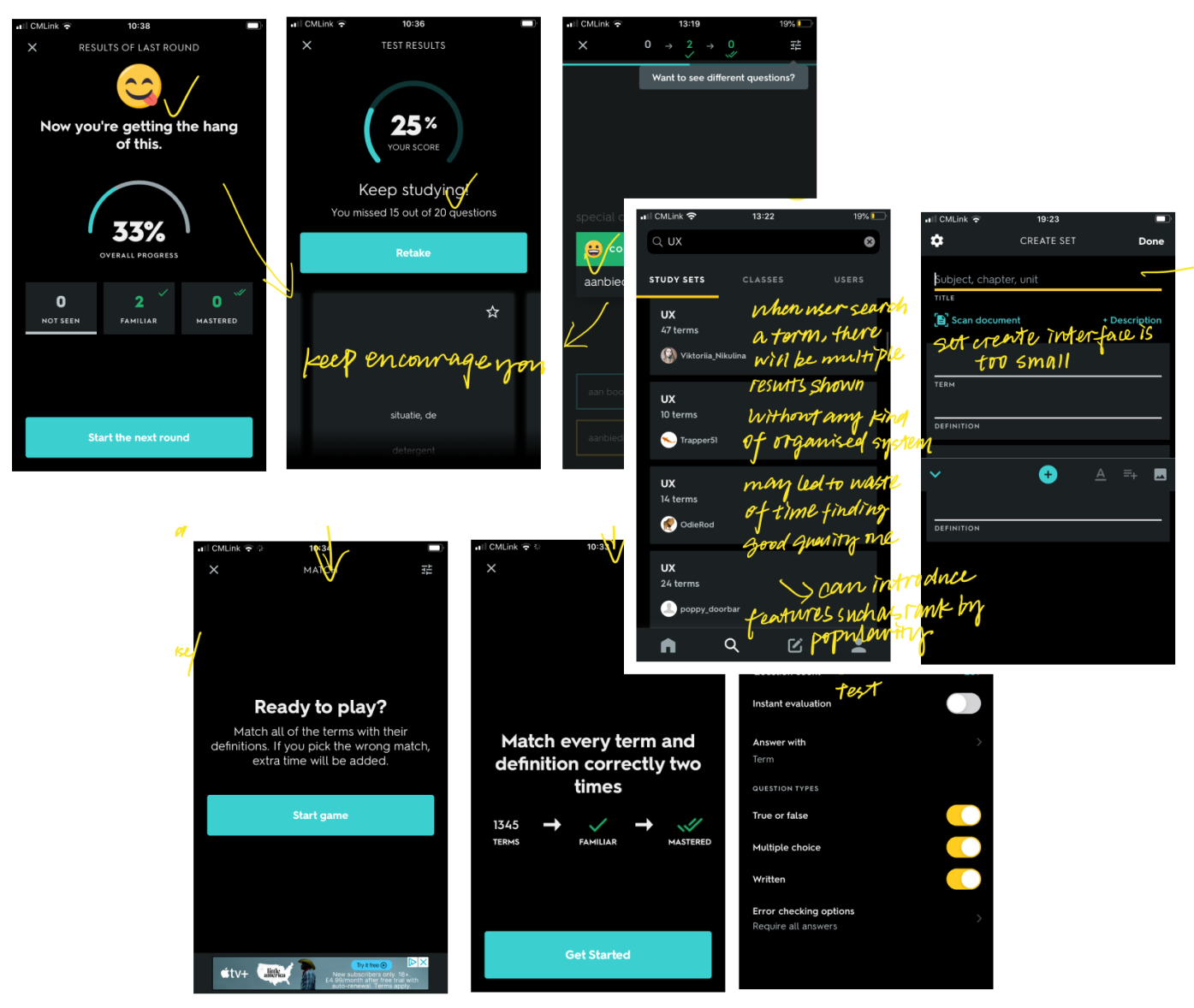
Search results with no hierarchy
When users try to search for a particular card topic, they are presented with overwhelming search results. This contradicts its purpose of saving users time in creating new cards.
Squashed input field
Create new sets/cards is one of the most important flows for a vocabulary learning app, however, both Anki and Quizlet deliver a bad experience for this (in mobile version). Their input fields are tiny and squashed, making it harder for users to create sets/cards.
I conducted user interviews with 4 people who have experience of using vocabulary learning apps, and I gathered my findings into Thinking Feeling and Doing, final insights are provide following.
Name: Lee
Age: 23
Nationality: British
Location: London, UK
Language: English
Occupation: Master student
Name: Jiayi
Age: 22
Nationality: Chinese
Location: Durham, UK
Occupation: Master student
Name: Swathi
Age: 28
Nationality: Indian
Location: New Jersey, USA
Occupation: UX student, Housewife
Name: Oliver
Age: 26
Nationality: Canadian
Location: London, UK
Occupation: Engineering
Interview questions
1. What is your daily routine like?
2. When is the last time you try to learn a new subject or vocabulary?
3. What motivated you to do so?
4. Do you use any apps to help you study?
How often do you use it and when do you use it?
5. How would you describe your learning style?
6. Did you succeed? Describe the features that you found particularly useful when learning new vocabulary
7. Tell me a time you’ve been abrupt and stopped using that app, what happened? /Do you have any frustrating experience with that app? Are there any features that could have made it easier for you?
| Insights
All participants mentioned the importance of context and application in their learning process.
It is important that vocabulary apps designed cater to individual needs, for example, enable users to add their own notes, choose their study pace, organised material in their own way.
2 out of 4 participants mention that they easily lose motivation with learning a new language, they want to be consistent with their learning but haven’t found a right way to do it.
People who are already work find it hard to dedicate a fixed time for vocabulary learning.
Students want to maximize their efficiency of learning when they looking for vocabulary apps.
Bring research into persona
Identify key features of the app
01 Personas - the students and the working group
02 User story and user flows
03 Revisit the problem & Brainstorm solutions
I understand it can be unrealistic to make assumptions based on limited data acquired, more user and market research are required in a real business context. With that being said, this should not limit me to make assumptions to get started and move forward my design.
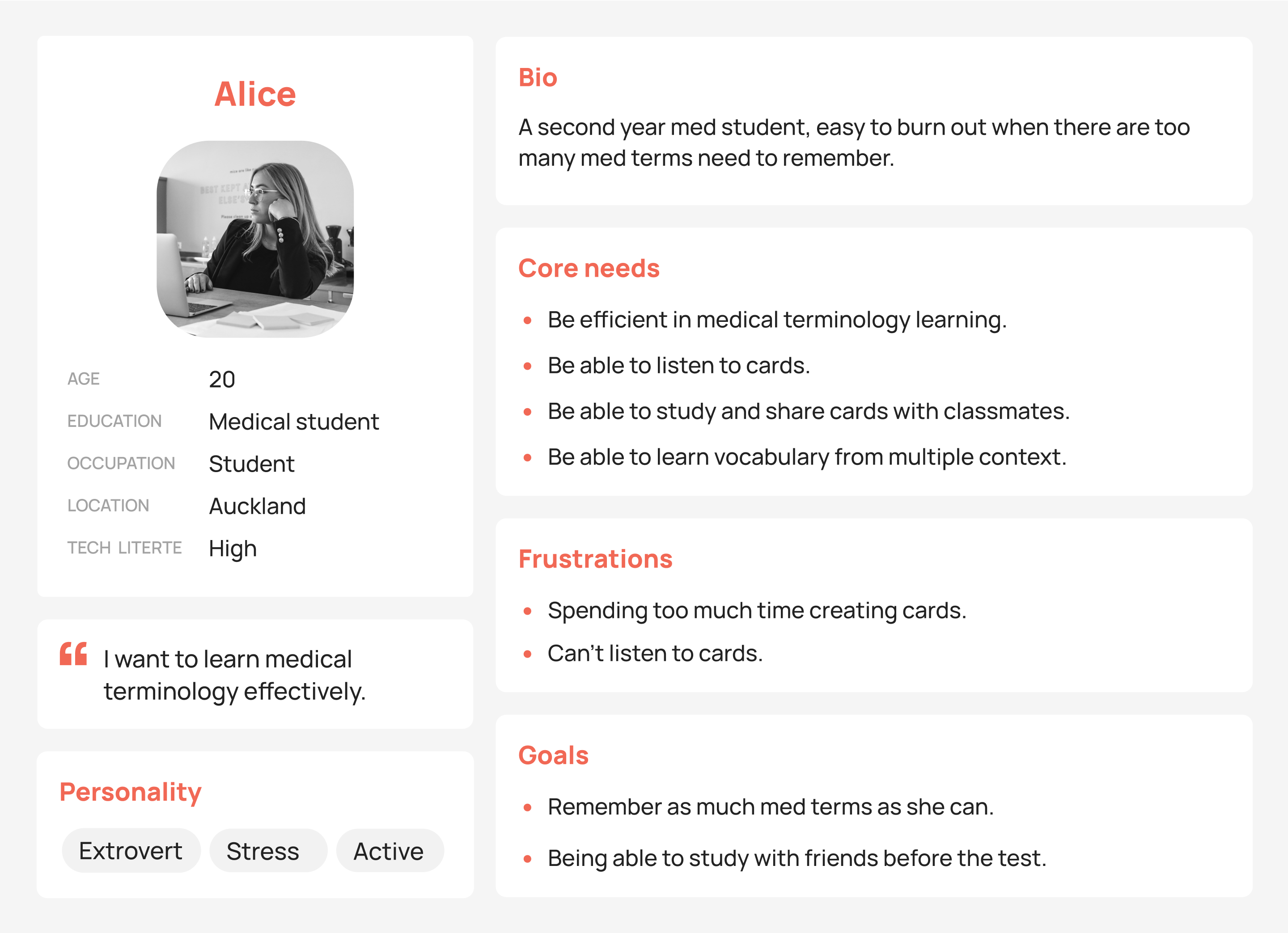
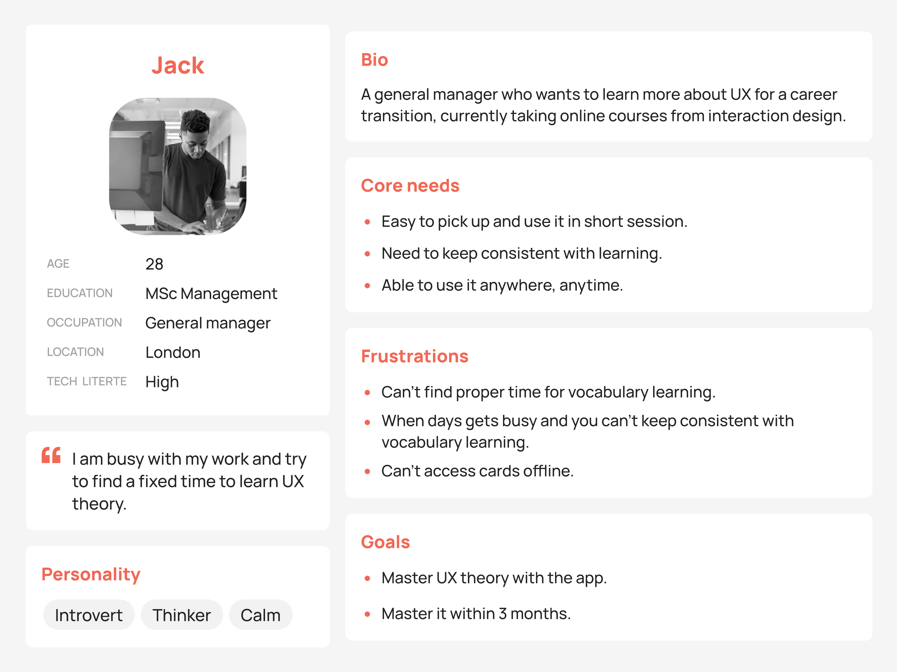
From user interviews, I find that there are 2 types users with different goals and needs, 1 is the student group, who want to maximize the efficiency of learning, the other is the working group, who need more of the motivation boost. Below you can find 2 personas created from the findings.
Next, I wrote down different user stories, here I picked 1 example to show the process.
| User story
As a busy manager who takes 30 mins train travel to London every day, I want to utilize my commute time to learn UX concept, so that it helps me make career transition faster to the UX.
| User flow
By now, I had a clear idea of what the user's frustrations and needs were, as well as the scenarios in which they might use the application. I also had several solutions in mind. Now it’s time to go back to the problem, brainstorm, and come up with more detailed features.


| Back to the problem
People lack motivation and find it difficult to study consistently, especially for those who are already working.
Bringing in knowledge from psychology, making something easy to do, people need:
1. Instant reward
2. Minimal friction
3. A supervisor, or a partner
4. Visualize the process
Then, based on use frequency and use coverage,
I decided which features to prioritise and proceed.
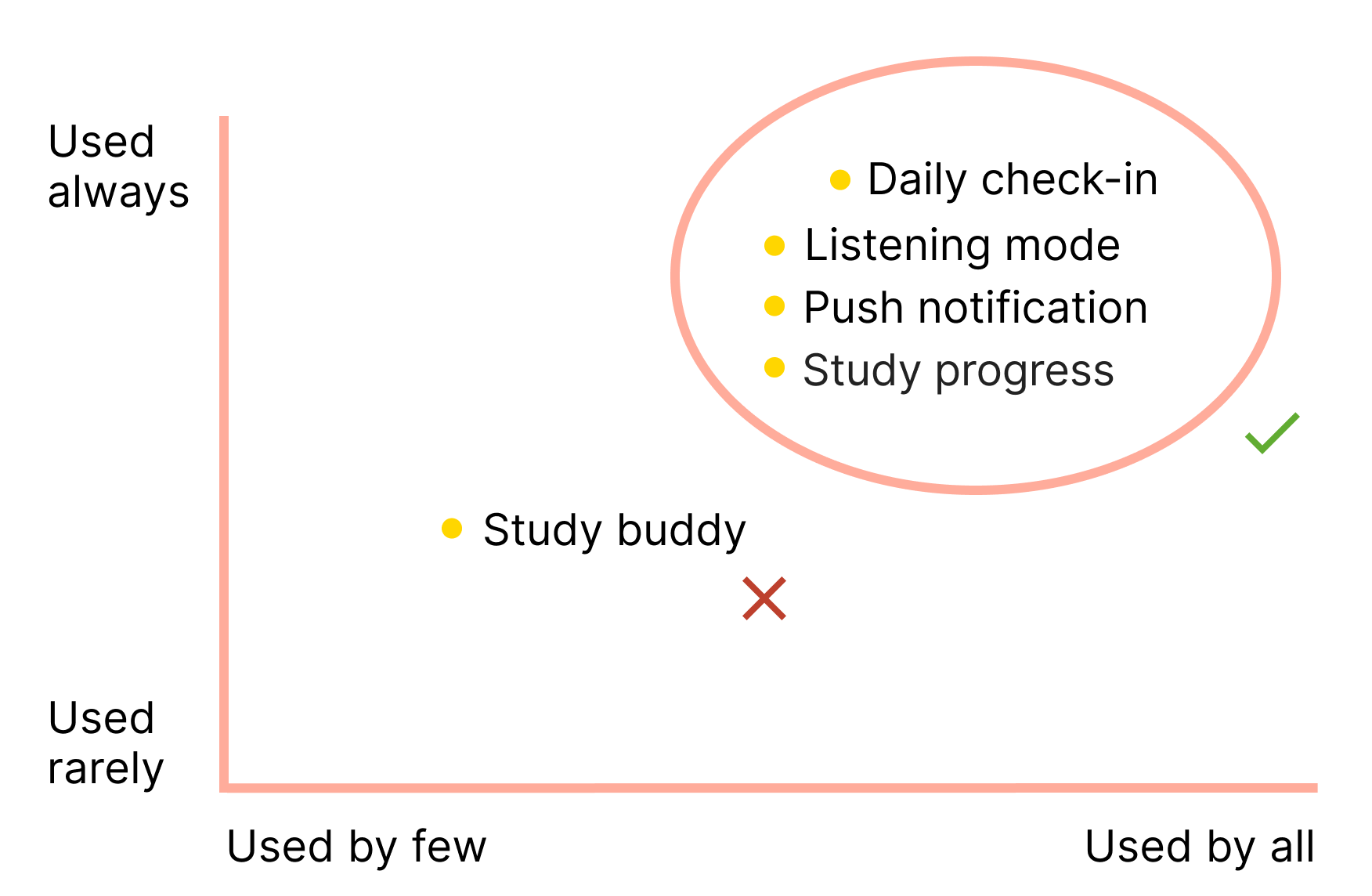
| Brainstorm solutions
Combined with previous research, and the knowledge from psychology, I came up with the following solutions:
1. Daily check-in + instant rewards.
2. Listening mode; Study reminder Push notifications.
3. Study buddy, match people in the platform. They can view each other daily report and leave encouraging words to keep each other motivated.
4. Showing user study progress.
| Design principles
Before move on to the actual design, I set myself following constraints to guide my design decisions.
Sketch out features with wireframe
Revise the design based on users feedback
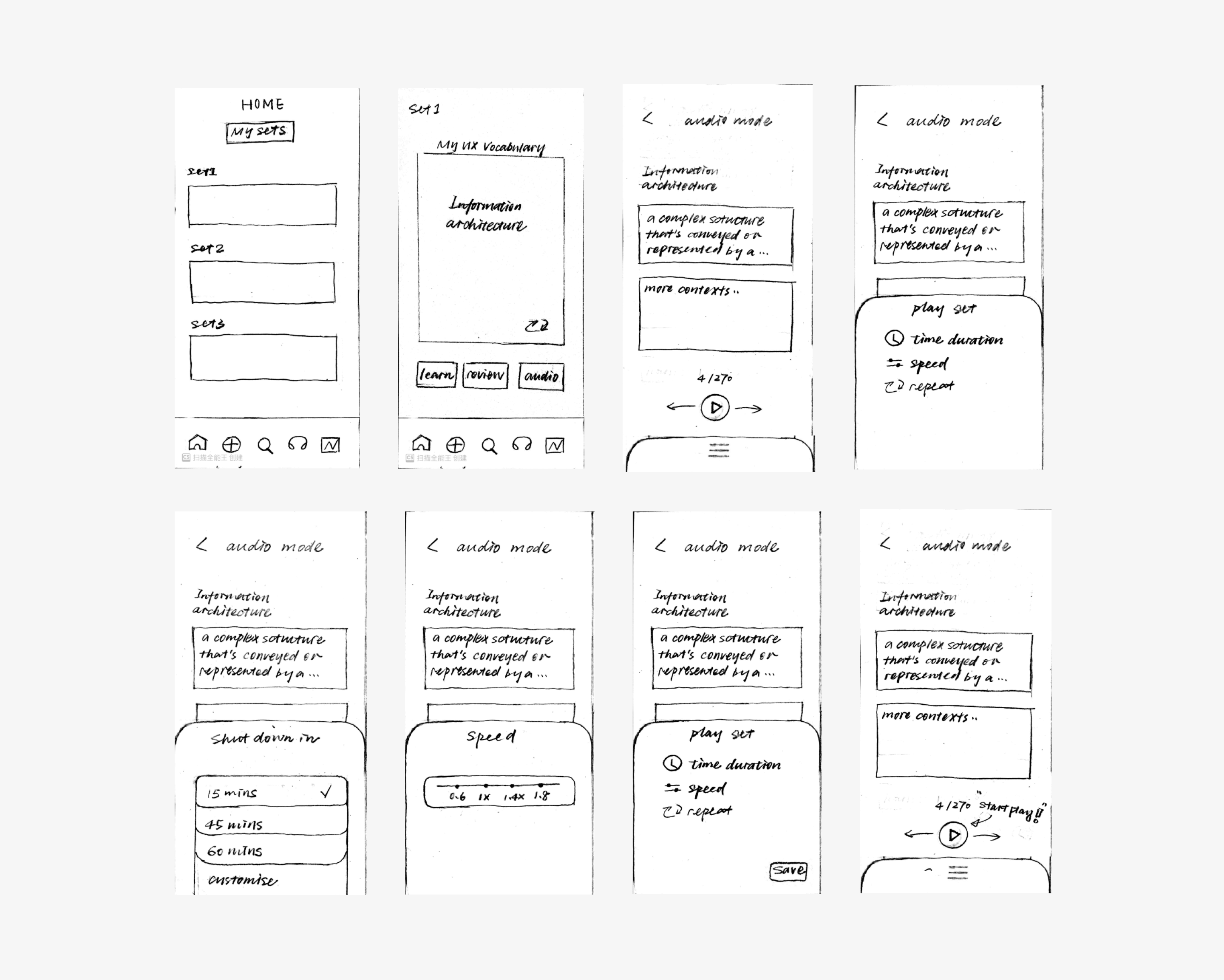
01 Low-fidelity wireframes
02 Design iterations
03 Final deliverable & Design rationale
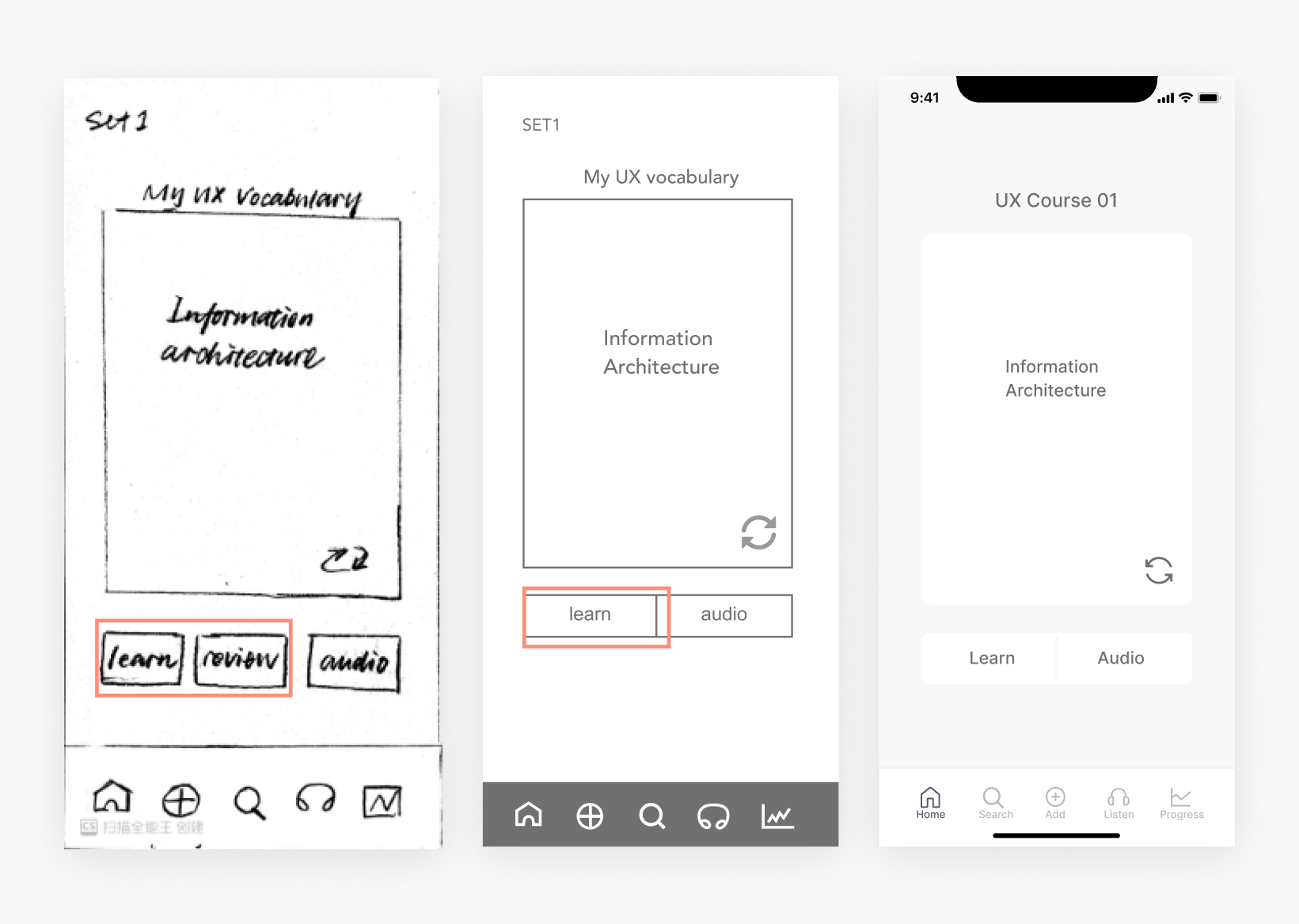
| Change
Remove review
| Rationale
I designed ‘’learn and review’’ based on language learning apps, which normally have a pre-existing vocabulary library. That means users can either learn new words or review the old. However, for a flashcard app that do not have a pre-existing library, learn and review mean the same thing. This mistake was spot by one of the participant who was confused about learn and review.
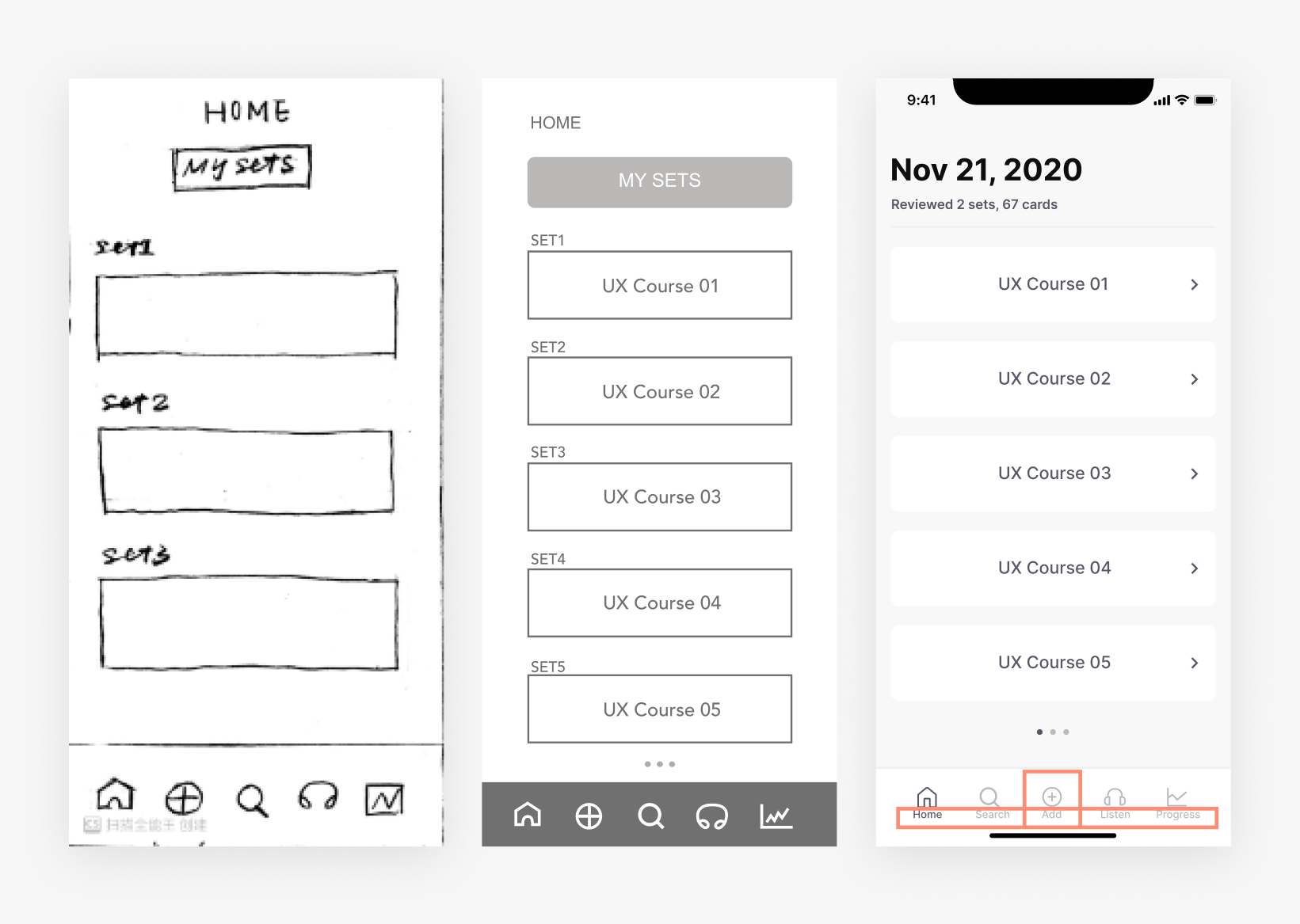
| Change
1. Center the add button
2. Add explanation text to the icons
3. Delete unuseful information (home, my sets, sets number), replace with todays’ study progress
| Rationale
1. Positioning add button in the center is based on logic and use frequency.
2. Two users think this information was redundant for study.
3. One participant mentioned that adding a text label could be clearer.
| Goal
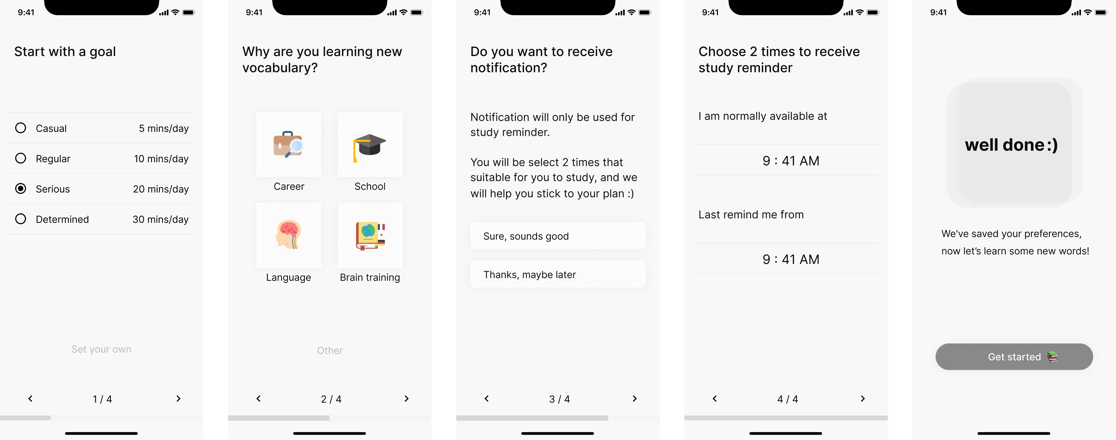
My goal for onboarding is to promote the value Easy Flash bring to the user. The answer collected will be used to send users notification and generate study overview.
| Detail
Questions are kept simple and relevant to maximize the likelihood of the user answering. A skip option is not provided as the questions are short (only 4), and the user can use the arrow key in the bottom to move forward if they don’t want to answer it.
| Detail
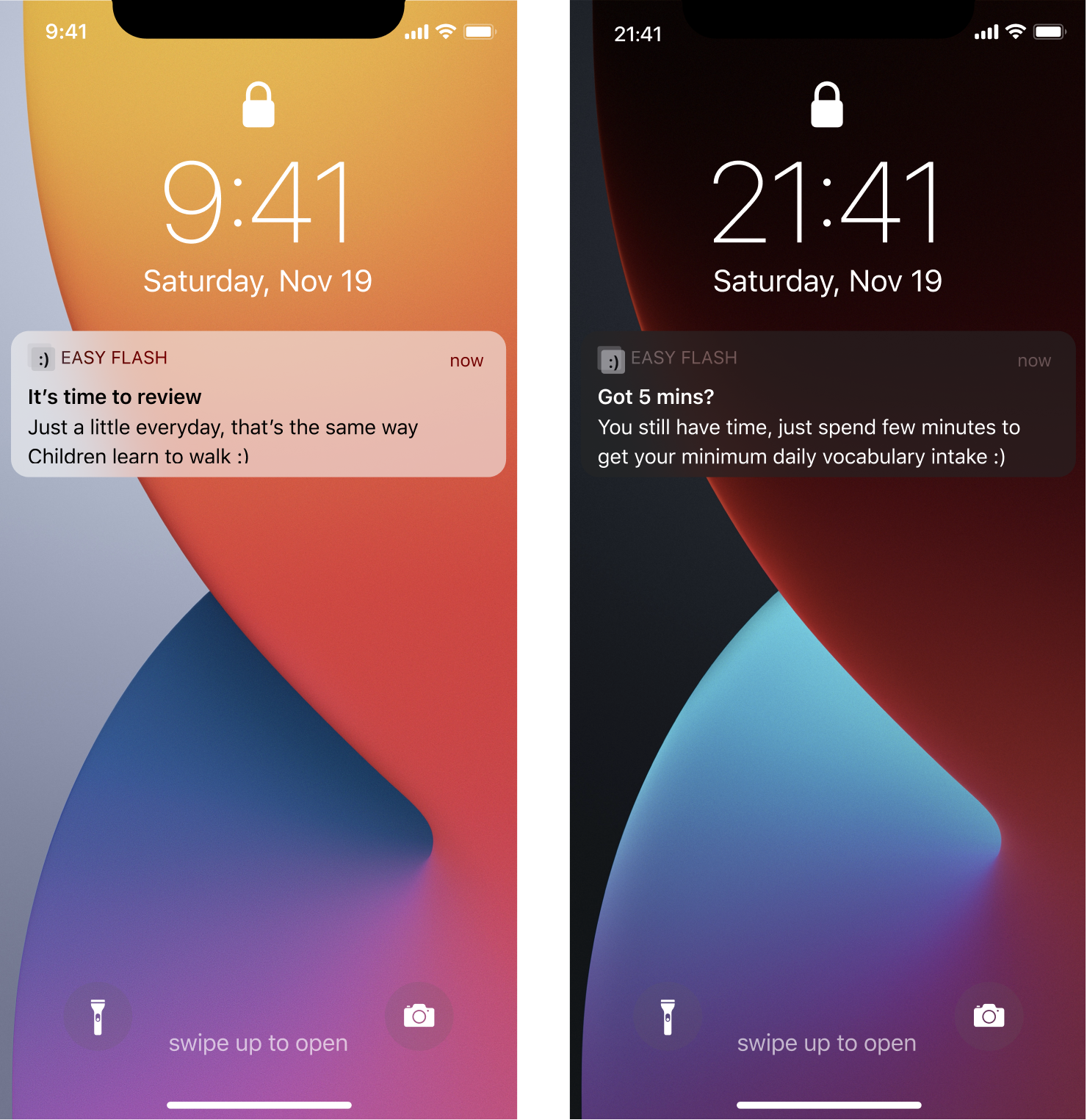
2 notifications. Sending daily notifications 2 times to the user (after the user give permission). The first is the ideal time/the time of the day they are free to study, the second is the last reminder. User are are able to choose the notification time during onboarding, you can also change in the settings.
Tone of voice. The tone of voice is conversational, free from stress. Reassuring users one step at a time, they are on their way of achieving their goals.
| Detail
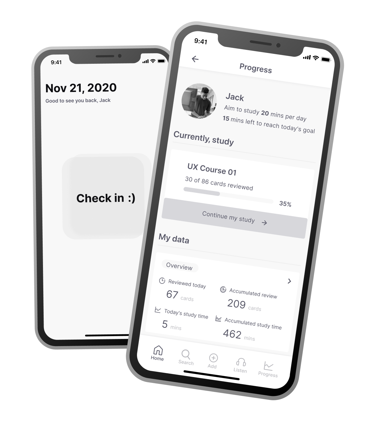
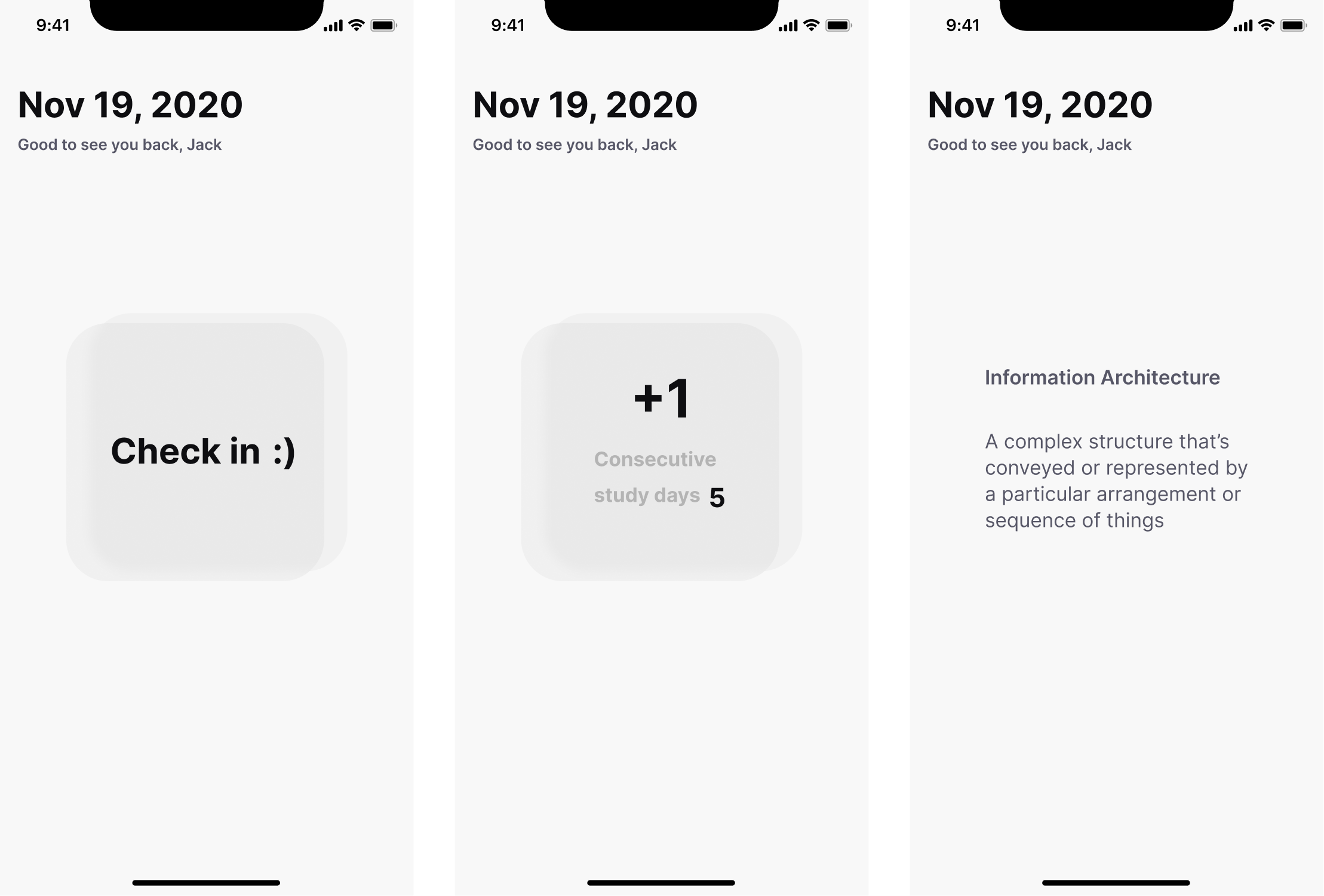
Every day, when a user first logs into our app, a check-in prompt will be displayed, after the user click on it, it will show 1)the days they continuously spent on studying 2) an enlarged +1. Then, the second screen will automatically dissolve into the third screen after 1-2 seconds, replaced by a random word.
| Rationale
Give user instant reward, user get added days (psychological reward) + a random vocabulary (knowledge reward).
| Detail
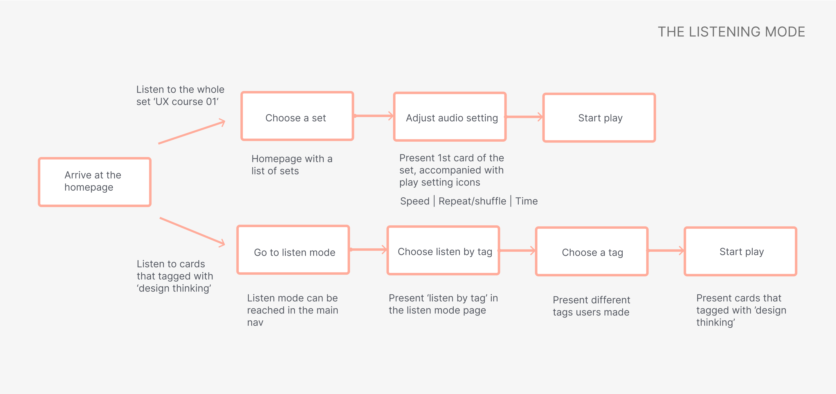
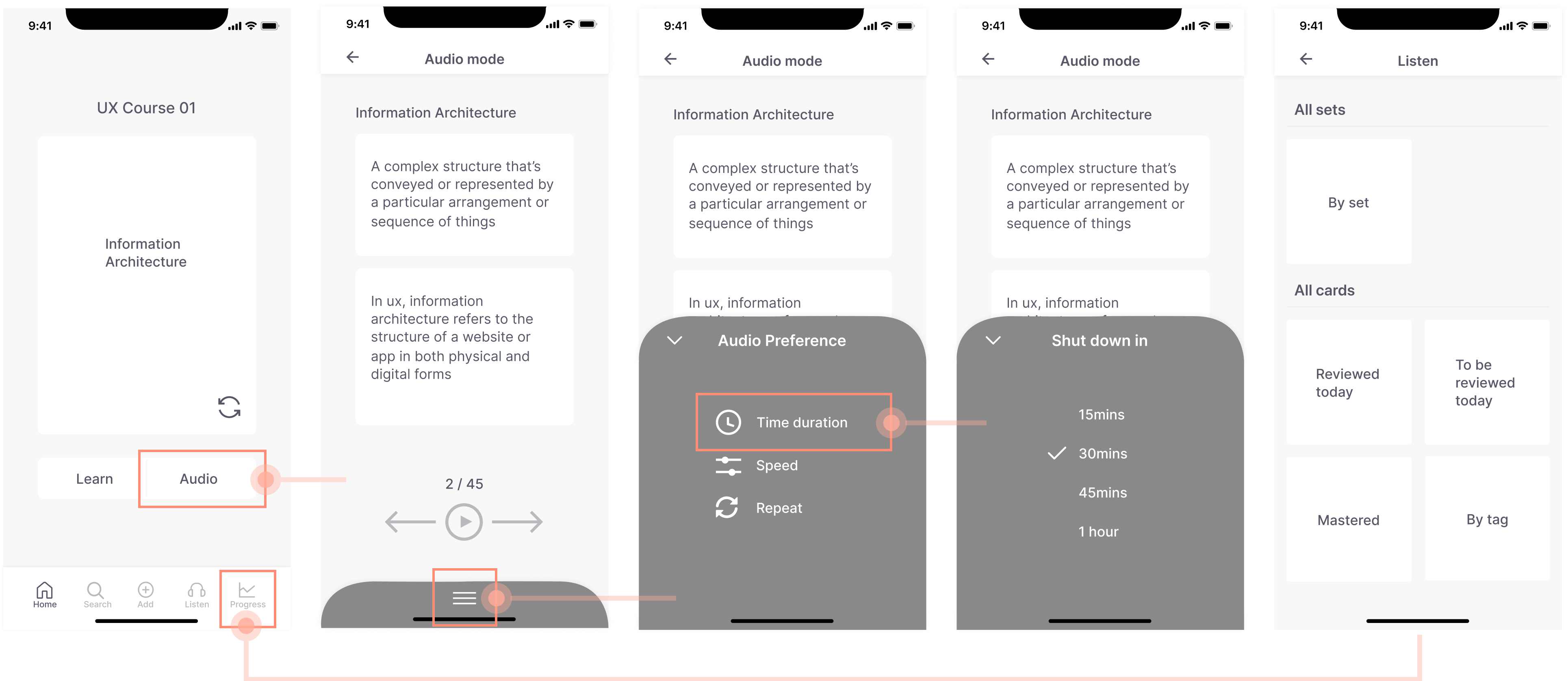
Users can either access the audio mode from a specific card, or they can go to the bottom navigation to explore more listening options. For example, they can choose to listen to all the cards with the same tag from the listen screen.
| Rationale
We give users great flexibility in the way they review. The audio mode itself is a strong USP that can maximize study efficiency for both the students and the working groups. With the listening mode, they can utilize their fragmented time to listen to the cards on the go.
| Detail
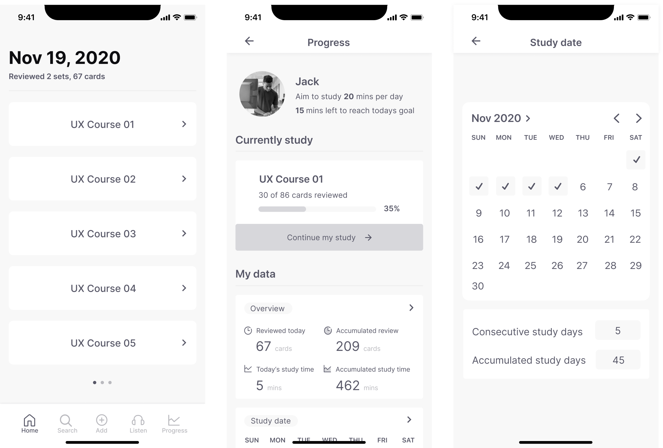
Showing users their current progress, provide days and time users spent on learning (both consecutive and accumulated days/time).
| Rationale
We all have days that things happens and we can’t stick to the original plan, imagine the frustration when you stick to a routine for 99 days and you get so sick in the last day and just couldn’t make it. People skipping things, to remove this frustration from our users, Easy Flash introduces accumulated days, to ease the pain of unavoidable skipping.
Make the most of pre-marketing research
A good marketing research can save a company a large amount of money/time on user research, there are many free resources available, finding a clever way to collect them could be cost-effective. Searching for vocabulary app review from YouTube is a good starting point, it quickly helps me identified what users want most from a language learning app - learning effectiveness.
Psychology and emotional design
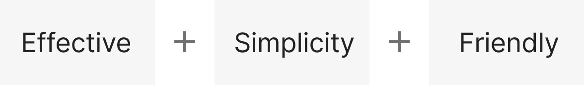
Good products are memorable and should trigger positive emotions. When building a vocabulary app, I want to minimize the frustration a user could have with learning vocabulary. The frustration could come from user itself for not being consistent, or it can be a result of poorly designed learning experience. Borrowing knowledge from psychology is a great fit for a vocabulary app that needs to help people build a healthy habit, think about what kind of emotions you want to elicit while designing can help you connected with your customers on a deeper level. For Easy Flash, my goal is to let my users feel positive, confident and content about their learning, therefore I went for efficient, simplicity and friendly to guide my design.
Refine the listening feature, since listening mode is our USP, we should spend more time on this to create a truly great listening experience for our users. Find out how users like to listen to cards, prioritize their preferences, making relevant adjustments.
The instant reward idea could be explored further by creating a point system. For example, users could earn +10 points when they log in each day, when they complete tasks, etc. The points earned can be used to make up the missed study days (again, user hate unavoidable skipping) or to reduce the membership fee.